Toward a typographic house style, part one: the scale
A publication with four posts still needs a type system. Small is exactly when the rules are cheapest to set.
Every publication faces the same temptation on day one: set body text at a comfortable size, pick a heading size that looks right, and figure out the rest later. “Later” is how sites end up with nine font sizes by month three and a stylesheet nobody wants to open.
This series documents the alternative: a house style fixed before the fourth post exists. Part one is the scale itself.
Six steps, no more
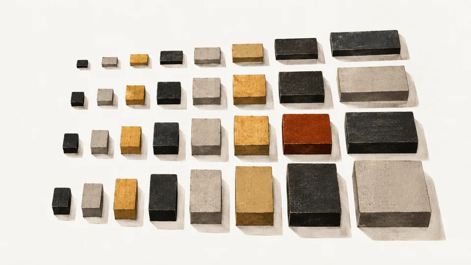
The scale here runs from --step--1 at 0.875rem up to --step-5 at a fluid maximum of about 4.6rem. That is seven sizes total counting body, and the rule is simple: if a piece of text needs an eighth size, the design is wrong, not the scale.
The small sizes are static. Captions and metadata read better with a fixed size that stays legible at every width, and there is no argument for a caption that grows because the monitor did. The large sizes are fluid, built on clamp() so headlines grow with the viewport without discrete breakpoint jumps.
The ratio between steps is unglamorous on purpose, roughly 1.25. Golden-ratio scales look great in articles about golden-ratio scales and produce heading sizes too far apart to be useful: the jump from body to headline either screams or whispers. A modest fourth gives every level a real job.
Why fluid beats breakpoints
A stepped scale snaps: 28 pixels until 768 pixels of viewport, then 34. Fluid sizing interpolates every pixel in between, which matters more for type than for layout because readers notice size changes mid-word. The clamp(min, preferred, max) form keeps the floor and ceiling fixed while letting the preferred value ride a percentage of viewport width.
The side effect is that headline sizes become a relationship rather than a number. --step-4 is always roughly one and a half times --step-2 regardless of the device, and the hierarchy survives every width.
There is also a maintenance argument nobody mentions: a stepped scale needs its breakpoints audited every time the design touches width. A fluid scale is defined once and holds forever, because the viewport is a continuum, not a set of phone sizes somebody hardcoded in 2019.
The base is the contract
Everything hangs off the body size, which here is a clamp between 18 and 21 pixels with a line height of 1.65. That single pair of values decides what every other step has to harmonize with. Get the body right and the scale is arithmetic. Get it wrong and no scale rescues the page.
The last rule is the one that makes a house style a style rather than a palette of options: components may not invent sizes. A pull quote, a card title, a footer, a sidenote: each maps to an existing step or it does not ship. Seven sounds restrictive until you count the sites that use fourteen sizes and achieve less hierarchy than this page does with seven.
Enforcement is deliberately boring. The sizes live in tokens, the components reference tokens, and the review question for any new element is one line: which step? If the honest answer is “none of them,” the element waits. That gate has already caught two would-be one-offs in the first month, and both designs got better when forced onto the existing rungs.
One more property of a small scale earns its keep quietly: it compresses gracefully. On a 320-pixel screen, seven steps still span the full hierarchy; on a 27-inch monitor the same seven steps reach the same ceiling without a second scale for “large” devices.
Part two covers the piece that usually gets decided last and regretted first: vertical rhythm, and why the spacing between blocks carries more of a page’s meaning than the blocks do.